Designing a comprehensive online exam, with no benchmarks
Role
Solo product designer
Agency
Cube10
Timeline
3 months
Simulating FRCS written exam*, to create a close experience for the candidates, was Saleh’s (our client) idea. To achieve this, he needed an analogous and standard question bank, a similar exam center, and an online exam platform.
As a digital agency we were supposed to design and develop the exam platform, and its marketing website. Challenging part for me was having no best practices and benchmarks to get inspired with.
I was tasked with completing the project as the solo product designer. Paladin, as the product manager, needed to be informed of all my decisions. Throughout the process, I consulted with him and Saleh (the client and owner of the project) to ensure staying on the right track.
*FRCS exam is a professional qualification required to practice as a surgeon in the United Kingdom and Republic of Ireland.
My outstanding skills
Communication
Information Architecture
Empathy
Critical thinking
Critical thinking
Rapid decision making
UI design
Final Deliverables:
- Teacher panel, for creating and managing the exams.
- Students panel, to access all registered exams and the analytical reports.
- A website to introduce the Mock Exam and persuade users to register for it.
Table of content
- Design constraints, as the compass
- The structure starts with navigation
1- Creating a specialized exam
2- Register and taking the exams
3- Analytical reports
- Overcoming the lack of best practices
- Client satisfaction as my KPI
Design constraints as the guidance
I see the design constraints as some essential rules that help me to find my way to start and proceed:
Budget constraints
The most important constraint is budget limitation. It can affect high level decisions like time frame of and resources. As a digital agency, our clients always want us to deliver their desired products, with minimum costs. It means there is no room for user research of any kind!
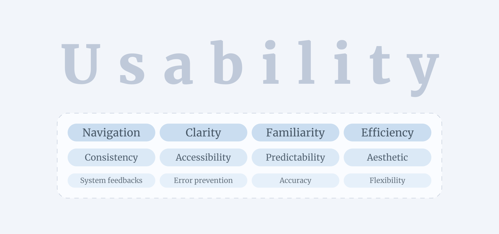
I do my best to compensate for the lack of user research by focusing on the different aspects of usability. My 6 years of experience across various industries, alongside my versatile skill set like, critical thinking, visual thinking and empathy, allows me to leverage established design principles and patterns, by limiting my design decisions.
Other constraints
There were other constraints, such as:
- Being aligned with the actual exam (FRCS written exam)
- Business model constraint, selling 2 exams package as their product.
Those constraints also guided my design decisions to be aligned with the business requirements.
The structure starts with navigation
We had 2 user types with different needs and goals (teachers and students), so I decided to design 2 separate panels. Also we needed a website to introduce Mock Exam, registration the exams, and other marketing purpose. Now I needed to identify the pages and flows for each of these parts.
I needed to see them as a whole, so I could establish the product structure. My solution was putting the business requirements into a narrative and walking through the whole journey.

1- Creating and publishing exams
Questions are the core of an exam
Client goal:
We need a question bank to store all the questions that we need for creating exams.
Design requirements:
- A page that hosts a large number of questions
User goals:
- Add new questions.
- Edit existing questions.
User potential pain points based on my assumptions:
- Adding a large number of questions one by one, might be frustrating and time consuming.
- To edit a question, the user should find it first, finding the desired question among a large number of questions could be another potential pain point.
- Navigating through this amount of question might not be so easy.
- Also the user might want to make an action on some questions. Repetitive actions are time consuming.

Teacher panel, Question bank page. All the questions will be stored here.
My design solutions to potential problems:
- A bulk import feature, using a CSV file to add a large number of questions way easier and faster than adding them one by one.
- Search functionality and filters that are mapped with the questions key attributes, to find desired question.
- I considered a name for each question to help users find and distinguish them easier. Also showing a part of question’s text prevent from redundant clicks for opening them to make sure if it’s the desired question.
- Adding proper amount of white space in combination with multiple sort options and pagination, makes the questions easier to scan and navigate.
- By adding bulk actions (which is only delete action to keep it simple), I tried to prevent repetitive actions.
How I dig deeper to improve usability, even more
Initially, I chose to design selectable attributes, such as subspecialties and difficulty levels, using a chip component for better scannability. However, during the second round of design review, I identified an issue with this approach.
New pain-points :
- Difficulty level is a relative concept that only holds meaning when compared to other levels. When users select a difficulty level for a question, all levels are visible, and there are no issues. However, the challenge arises in the view mode of questions. I realized that a single difficulty label is insufficient to convey the exact level of each question. For instance, how can a teacher determine if “Easy” is the lowest level or if there is also a “Very Easy”?
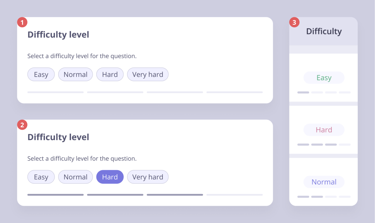
Teacher panel, Questions difficulty levels.
Adding a stepped difficulty bar was my idea to overcome this problem. Visual cues make the design intuitive and easier to understand.
1. Default view of selecting difficulty level for a question.
2. By selecting a chip, the stepped difficulty bar gives a visual feedback about how difficult is this level.
3. I repeated this, in the questions list (view mode). With this solution, even a new user could understand how difficult each question is. I also used colors for the texts as another visual cue to make it more scannable.
breaking down a long task, to make it more efficient for users
Client’s input:
Based on the actual exam (FRCS), each written exam has 2 parts called “Papers”. Those papers contain different set of questions.
My first solution:
The user clicks create exam, then add papers to it and fill the papers by existing questions separately. But I wasn’t happy with that solution.
User potential pain points based on my assumptions:
- It’ll be a long task for the users, and increases the mistakes.
- Add/remove questions for an existing exam would be a complex task and might cause confusion.
Teacher panel, create paper by adding questions.
My design solution:
- I created a new tab in side navigation menu for “Papers”. So the user could create each paper separately. Breaking down a long task to smaller ones make it easier to follow and decreases potential mistakes.
- Now for creating an exam the user need to add papers that already filled by questions. Also, the ability to change the papers of exams makes the design more flexible.
Layered side sheets
I drew inspiration for adding questions to the paper interaction from Google Tag Manager. The layered side sheets feel temporary to address user concerns which is “leaving an unfinished task”, while serving as expansive pages with multiple functionalities.
A key part of my problem-solving process is selecting the right UI element for the defined problem. It should effectively convey the design’s intention while being familiar and easy to use for users.
2- Marketing and registration
Client’s input:
We need to persuade potential customers to buy our service. They should be able to buy the exams as well.
Design requirements:
- A landing page to turn the visitors to a customer with marketing methods.
- Exams page to show the published exams and other detail about them.
- A pricing page with information about what we offer along with a purchase CTA.
- Other pages like, valuable resources and suggested study plan to establish trust and value.
Landing page, the core of the website
Home page of website. Where we tried to bring the users attention and then convert them to customers.
My solutions turn the visitors to customers
- A relevant and clear hero section including a relevant image that evokes a study environment in the user’s mind, a high-priority headline pointing to Mock Exam’s primary mission, a subheading with lower visual priority highlighting Mock Exam’s core value from the user’s perspective, and a clear, accessible CTA. My purpose was to be clear and valuable at a glance so the user doesn’t get bounced and want to scroll for more information.
- Real screens of the panel makes user feel the product and evokes curiosity.
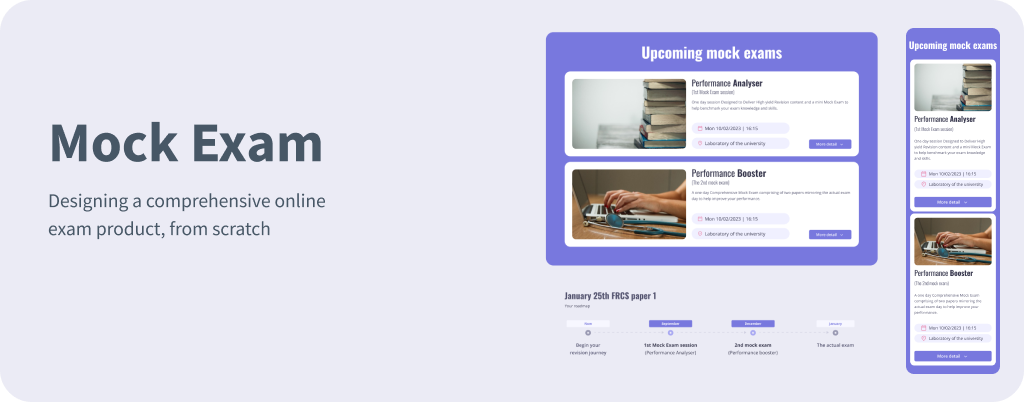
- Detail about the exams along with a capacity percentage, has multiple benefits for us. The user sees that there are other students that trusted us, also the limited capacity persuade users to register by creating FOMO.
- Answering this users’ question, “Why should I pick you over others?” through a comparison table. Visuals are way more effective than texts.
Make users come back to the website
Client’s input:
The FRCS exam candidates always seek for prominent resources. I have a rare study plan to offer them.
User potential pain points based on my assumptions:
- Reading long columns of text must be exhausting for the user.
- They might not understand the value of this plan if it doesn’t attract them.
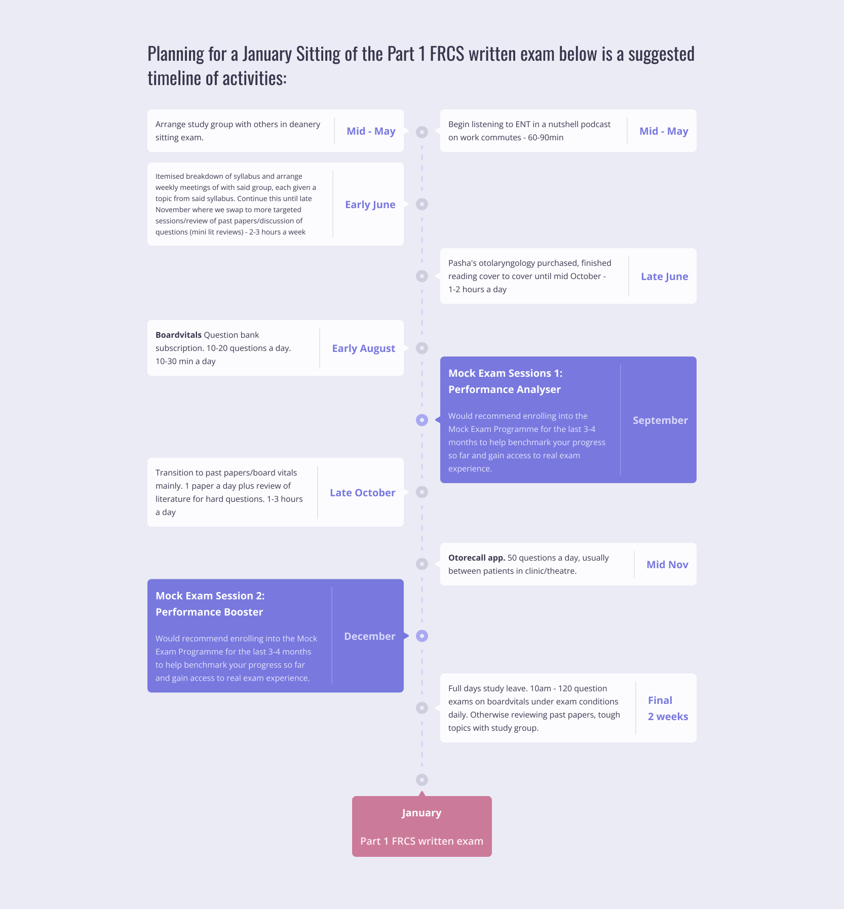
Resource page, Study plan timeline. It’s both a study plan and a CTA.
My solutions to reveal its potential as much as I can
- It should be perceived as a plan and be scannable. So I’ve demonstrated it by a timeline.
- I tried to design it visually appealing to grabs the user’s attention.
- To pass an exam, study wouldn’t be enough. What’s missing is a practice exam to asses what you’ve really learnt so far. This was my marketing solution to show how they need Mock Exam by putting the exams within the study plan.
3- Holding the exams
Doe’s the exam is held by itself?
Something I had not considered until then, was managing the exam. It’s requirement reveals through a weekly session when we reviewed the whole journey with Saleh (Client) and Paldin (PM).
We agreed that a facilitator needed to manage the exam according to the specifications and predefined times for the papers and breaks between them. Saleh also, brought this up that participants shouldn’t be able to have access to the exams, outside of the exam center. We had a quick brainstorm and finally came up with the idea of putting a password for starting each exams.
Exam panel, Exam management. Here is the control panel of the exams.
My solutions to reveal its potential as much as I can
- I decided to put everything that needed, including the entry password and control panel on one page to prevent potential errors that might happen while navigating back and forth through different pages.
- Exam details and schedules help the facilitator see all the information in an organized manner. I designed the start and end action of each paper separately, allowing it to be done manually or automatically to provide more flexibility for the facilitator.
4- Exams results and analytics
In detail results and analyzing of the exam is one of Mock Exam’s key values, enabling users to identify their strengths and weaknesses. Also the teacher assess the exam quality and standards.
Preparing exam report by the teacher
Client’s input:
There should be a possibility to exclude some questions from exam’s result by the teacher. Also they should be able to see the “Normal distribution” of the results.
User needs based on requirements:
- The teacher should be able to find questions with unordinary results which are the questions with too many right or wrong answers.
- The results must be scannable for the user to minimize their spending time.
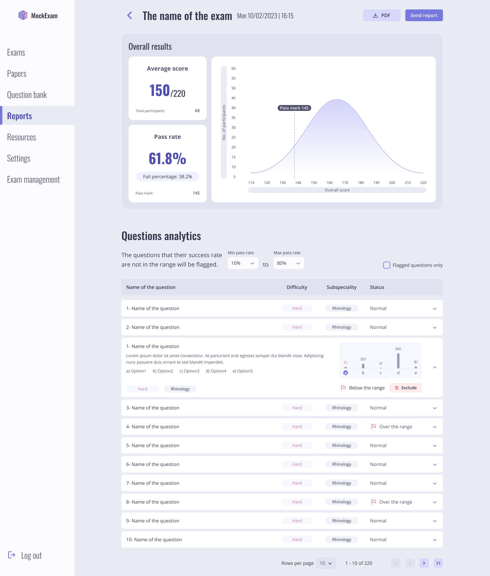
Teacher panel, Analytical report of the exams. The teacher must review all the questions and exclude the mistaken ones, to make the final results more accurate for each participant.
My design solutions to the user needs
- I designed a feature so the teacher could identify a custom range for the average pass rates of questions. Then the questions with pass rate outside of this range would be flagged to be reviewed and excluded one by one.
- I prioritized the information of this page based on their importance, then emphasizing them with visual hierarchy to make the page scannable and effective.
A practical design for exam reports
After reviewing and removing problematic questions, a report will be published, allowing students to see their exam results.
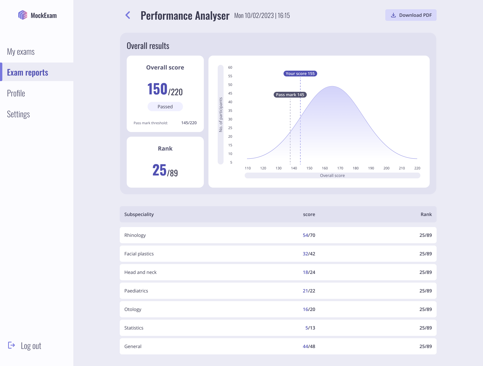
Student panel, Analytical report of the exams. In detail report of subspecialities is really insightful.
My design solutions
- I applied visual prioritization effectively on this page as well, making important data easier to scan. In addition to seeing their scores and ranks, students can compare their performance with other participants in a meaningful using bell curve chart.
- At the bottom of the page, students can see their scores and ranks across each sub-specialty, helping them identify their strengths and weaknesses.
How I overcome the lack of best practices
Quick and short iterations
My main achievement was managing the project from start to finish as the sole designer. My ability to think with a product-centric approach allowed me to consider all aspects from the beginning and integrate the requirements as part of a larger product. To achieve this, I adopted a process of creating rapid design and feedback cycles with the client. This method enhanced the final product’s quality, aligning it with the client’s desires and ensuring their satisfaction. It also increased my efficiency, allowing me to complete the project in a reasonable timeframe.
Spiral animation, demonstrating how my quick round of iterations helped complete the project.
In the first step I gathered as much as data I could, mostly by listening to the client. Then I’ve defined the business requirements and expectations. In the next step I designed the first draft and presented to the client. His feedbacks reveals new insights to me, also we discussed the new parts of product.
I’ve continued this process until I connected all dots together and finalized the design.
In parallel design the different parts
Due to the client’s data and requirements being somewhat incomplete, I took a collaborative approach to gather the necessary information without being overly assertive.
I would suggest potential pathways forward in weekly sessions. This allowed us to engage in a constructive discussion with the client, ultimately aligning our visions and reaching a shared understanding.
In parallel design progress demonstrate how all parts of product was completed.
Client satisfaction, as my KPI
Client satisfaction is my primary KPI, and I achieve this by closely aligning project scope with client needs and budget. I prioritized clear communication and collaboration with stakeholders to ensure everyone was informed and aligned.
My strong negotiation skills and critical thinking enable me to navigate complex project requirements and advocate effectively for user needs. By fostering an environment of open dialogue, I facilitate the gathering of insights that inform design decisions. This approach not only enhances the overall product strategy but also ensures that the final deliverable resonates with both clients and end-users.
By focusing on mental models through design principles and leveraging my ability to synthesize feedback, I create intuitive workflows that enhance usability and drive satisfaction.
Testimonial
As a design and development agency we put our client first. The scope of the project determines based on the budget and what they want from us.

Sale Okhovat
Sale
Founder of MockExam
More to read
ConneXing
Lorem ipsum dolor sit amet consectetur. Tellus a tellus vestibulum facilisi consequat feugiat. Penatibus faucibus porta in viverra vulputate varius facilisis aliquam condimentum.
ConneXing
Lorem ipsum dolor sit amet consectetur. Tellus a tellus vestibulum facilisi consequat feugiat. Penatibus faucibus porta in viverra vulputate varius facilisis aliquam condimentum.